Serendi
1. Investigation
Competitive Analysis
We looked into the existing services around traveling and found that there are basically four marketing areas. Services like TripAdvisor help users plan their trips beforehand. Yelp and Foursquare allow users to look for points of interest on the go. Platforms like Medium provide people with online communities where they can share their traveling experiences when they are back. Our focus was on the services provided during the trip (the red area shown in the chart). We found that although there are big companies like Facebook, their services are mostly synchronous, meaning that the recipients can see the public or private messages right after they have been sent out. There still remains a lot of marketing opportunities for asynchronous communication services.

Competitive Analysis
User Research
Findings
Secondary Research
-
Solo travel is a rising trend.
-
Mobile technologies support solo traveling since people can keep in touch with others while being physically away.
Interviews
(12 participants)
-
In general, people are less interested in receiving messages from people not in their close network.
-
People's opinion vary on who they want to share the travel experiences with and who they are willing to consult to.
Survey
(72 respondents)
-
The top 3 most important pieces of information are transportation, points of interest, and dining, which are all location-based.
-
85% of the respondents would not turn to their friends and family for help during traveling.
-
People wants to leave an asynchronous message to other people during the trip because they want to 1) help people 2) strengthen the friendship 3) create surprises.
Design Implications
Our design should
-
Facilitate the asynchronous communication while traveling.
-
Include location-based information.
-
Give users the control on who they want to share the information with.
-
Give users the control on when they would like to receive messages.
-
Help people create surprises for their friends and family.
Personas
With the help of a top-down affinity diagram, we were able to categorize our 12 interview participants into 3 types of users based on their personalities, behaviors and goals.
Following the UCD framework, we used personas to create scenarios and user tasks, and brainstormed features and solutions based on those tasks.

Affinity Diagram
Primary User

Joe
Primary User

Shradha
Secondary User

Yotosha
"I want to know how my friends like my recommendations. Sharing is about telling people what I like, and get their feedback..."
"I love my friends and family, but sometimes I just want to stay with myself. I'd like to get to know people more in-depth."
"I count on myself since my preferences and interests are so much different from others."
Problem Statement
How can we enrich the solo travel experience by making it more fun, informative and serendipitous?
People go for solo travel for the sense of freedom and adventure. However, sometimes it could become lonely, boring or even frightening. We believe by connecting people with the past or future travel experiences of their friends and family who have been to or will be traveling to the same place, the mobile application Serendi can innovate your solo travel experience.
Role
Interaction Designer, User Researcher
Conducting user research, analyzing quantitative and qualitative data, building low and high fidelity prototypes
Methods Used
Competitive analysis, Secondary research, Survey, Interviews, Affinity diagram, Personas, UCD Framework
Tools Used
Balsamiq, Sketch
Team
Tingwei Chang, Yingri Guan
Timeline
8 Weeks
2. Ideation
Based on the design implications and user tasks from user scenarios, each of our team members took 2 tasks and sketched five parallel ideas for each. Here are our initial sketches.
 |  |  |  |  |
|---|---|---|---|---|
 |  |  |  |  |
 |  |  |  |  |
 |  |  |  |  |
 |  |
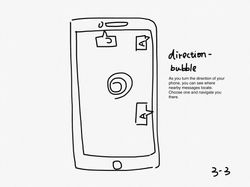
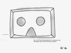
We then worked as a team to discuss the feasibility and opportunity of each idea. After consolidating our ideas, we iterated and refined the initial sketches into the following final sketches that led us to the prototyping stage. (Click to see explanation on each.)
 |  |  |  |
|---|---|---|---|
 |  |
3. Prototyping
Each of us took some sketches and transformed them into low-fidelity prototypes using Balsamiq. I refined and made them interactive by adding animations and linking hotspots in inVision.
4. Evaluation
Later we used this prototype and ran a round of user testing with four participants. The contents on the screens will change in response to the use scenarios, as participants followed through the tasks listed below.
Tasks for user testing:
-
Log in the home screen.
-
Open the message left by Yotosha and reply him via Facebook Messager.
-
Set up a new friend list.
-
Leave a location-based message for here.
-
Leave a location-based message for somewhere else.

For each participant, we recorded the response by listing down the behaviors, mental models, and possible solutions. To prioritize the usability issues that have been surfaced, we first grouped them by the screens and added up the frequency of each issue encountered across all participants. Each of us rated those usability issues with severity from 0 to 4 individually, then we averaged the severity ratings to remain unbiased.
Usability Report for One Participant
5. Iteration

Iterations for some of the screens
We identified 11 prioritized usability issues from the user testing and iterated based on them.
6. Outcome
To practise visual design skill, each of us took a few low-fidelity screens and refined them into high-fidelity screens in Sketch following a design guideline to maintain visual consistency.
 |  |  |  |
|---|---|---|---|
 |  |  |  |
 |